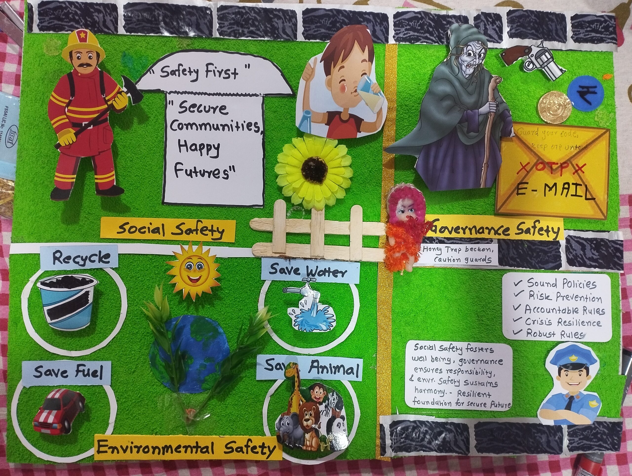
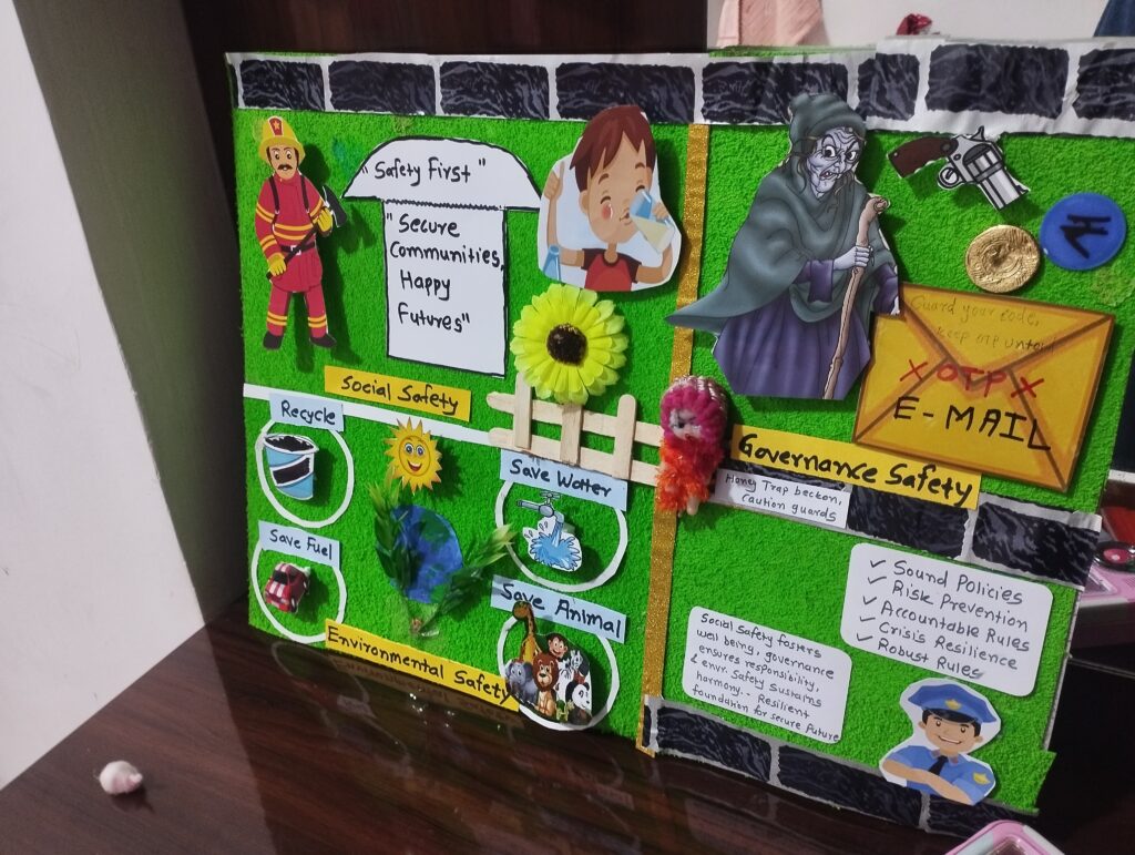
Poster for safety week poster competition 2025


Creating an engaging and impactful poster for a National Safety Week competition is a fantastic opportunity to contribute to raising awareness about safety issues while showcasing your creativity and design skills. National Safety Week is a significant event aimed at spreading awareness about safety measures, practices, and the importance of reducing workplace accidents and health hazards. Participating in a poster competition for this event requires a thoughtful approach to content, design, and message. Below, we delve into the process of creating a winning poster, from understanding the theme to effectively communicating your message.
1. Understanding the Theme
Before you begin designing, thoroughly understand the theme of National Safety Week. Each year may focus on different aspects of safety – workplace safety, road safety, cyber safety, or emergency preparedness, among others. Research the specific theme of the year, gather statistics, and find out why it’s important. This will give your poster depth and relevance.
2. Brainstorming Ideas
Start with brainstorming sessions to generate ideas. Think about the message you want to convey. Do you want to highlight statistics, offer safety tips, or tell a story that underscores the importance of safety? Consider your audience – are you targeting a general audience, children, professionals in a specific industry? Tailoring your message to your audience increases the impact of your poster.
3. Crafting a Clear Message
Your poster should communicate a clear, concise message. With a plethora of information available, it’s crucial to distill your content down to one main idea that is easily understood at a glance. Remember, the most effective posters are those that can communicate their message quickly and clearly.
4. Designing Your Poster
Now, let’s talk about the design elements of your poster:
- Layout: Keep your layout simple and organized. Use the hierarchy of information to guide the viewer’s eye through your poster. The most important message should be the most prominent.
- Color Scheme: Colors can play a crucial role in conveying emotions and drawing attention. Choose colors that align with the message you want to convey. For safety posters, bright colors can grab attention, but make sure they don’t overwhelm your message.
- Imagery and Graphics: Use images and graphics that are relevant to your theme. Images should complement your message, not distract from it. Icons and symbols related to safety can be effective in making your poster universally understandable.
- Typography: Choose clear, easy-to-read fonts. Your headline should be the largest text element on the poster, followed by subheadings and body text. Avoid using too many different fonts, as this can make your poster look cluttered.
5. Adding Information and Statistics
Incorporating statistics and factual information can lend credibility to your poster and highlight the significance of the safety issue you’re addressing. However, make sure to present data in an easily digestible format, such as through infographics or charts.
6. Call to Action
Include a strong call to action. Tell your audience how they can contribute to safety, whether it’s by adopting safer practices, participating in training, or simply being more aware of their surroundings. Your poster should not only inform but also inspire action.
7. Feedback and Revision
Once your initial design is complete, seek feedback from others. Different perspectives can help you identify areas of improvement you might not have noticed. Be open to critiques and ready to make revisions. The goal is to create the most effective poster possible.
8. Finalizing Your Poster
After revising your poster based on feedback, it’s time to finalize it. Make sure all elements are correctly aligned, the text is error-free, and the resolution is high enough for printing. Remember, the quality of the final print can significantly impact the overall effectiveness of your poster.
9. Presentation
Consider how and where your poster will be displayed. Make sure it’s accessible and visible to your target audience. If it’s being judged in a competition, ensure it meets all the submission guidelines.
Conclusion
Participating in a National Safety Week poster competition is not just about showcasing your design talent; it’s about contributing to a culture of safety and awareness. By following these steps, you’re well on your way to creating a poster that not only stands out in a competition but also makes a meaningful impact on its viewers. Remember, the most successful posters are those that can change perceptions, inspire action, and ultimately contribute to a safer environment for everyone.

